How to Sell Designs on Merchandise With Character
Share
A funny T-shirt starts working long before someone puts it on. It begins with the tiny recognition moment on a Schaerbeek pavement, at a Monday desk or outside a crowded café: “That is painfully accurate.” If you want to sell designs on merchandise, that moment matters more than adding another graphic to a blank product.
People do not need more objects that say nothing. They make room for a shirt, cap or sign when it gives a familiar part of life a sharper line, a good visual or a joke they want to repeat. The job is not to decorate merchandise. The job is to give it a reason to exist.
Merchandise is not a blank canvas
A design can look excellent on a screen and become strangely quiet on a sweatshirt. Or worse, become a postcard trapped on somebody’s chest. Merchandise has a job to do in the real world. It moves, folds, catches rain, sits above a coat rack and has to make sense from two metres away.
Start with the object, not the upload button. A T-shirt is personal and mobile. A cap offers a small stage, so the idea needs to be concise. A Dibond sign gets read from a hallway, a garden gate or the toilet door. Each surface asks for a different volume of voice.
That is why a detailed illustration may suit a larger back print, while a dry, compact sentence can carry a sign all by itself. The words “Notary Parking, violators will be disinherited” do not need fireworks around them. The joke arrives because the language belongs to the notary’s world.
To sell designs on merchandise, find a real observation
The most wearable ideas often begin with something ordinary that has been noticed properly. Think of the cyclist who treats a red light as an editorial suggestion. The office colleague whose mug has become a permanent fixture in every video call. The person who takes their local bakery recommendations more seriously than municipal planning.
These are not customer profiles in a spreadsheet. They are little pieces of city life. Sketch the scene, write down the phrase people actually use, then look for the angle that turns it into a design. Specificity gives a joke its legs.
Local references can travel well when the feeling is recognisable. A Schaerbeek reference may make a neighbour smile first, but anyone who has defended their neighbourhood’s favourite frituur, café or park knows the instinct. You are not trying to explain every detail. You are rewarding the people who get it.
There is a trade-off. A very local design can have a smaller audience, yet it can mean much more to that audience. A broad design may reach more people, but it needs a cleaner idea to avoid becoming wallpaper. Neither route is wrong. Choose the one that fits the thought.
Let the product decide how the idea speaks
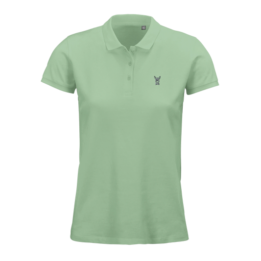
WearArt works when the design feels like something a person wants to be seen in. That can mean a bold illustration, a bright block of type or a small reference placed where people notice it on the second glance. Apparel also lets the wearer choose a garment colour that suits them, which changes the mood without changing the design.
Do not treat every colour as equally flattering to every print. A warm illustration may sing on a natural cotton tone and disappear on yellow. A black line drawing can look crisp on a pale tee but lose its detail on a dark hoodie. Make deliberate combinations, even when customers have colour choice.
SignArt has another rhythm. Most signs are gifts, so the recipient needs to understand the gag quickly. A fake parking warning for a teacher, developer, cook or notary works because it borrows an official visual language, then sends it slightly sideways.
Here, readability wins. Keep the main line visible at a glance. Give the pictogram room to breathe. A sign with six clever ideas is usually a sign with one idea hiding under five others.
A strong design needs a story, not a speech
The story behind a design helps people choose it, but it should not require a museum audio guide. One or two sentences can do the work: where the idea came from, what local habit it pokes at, or why a particular colour belongs in the piece.
This is especially useful when several designs share a theme. A retro collection can feel connected through its palette, line work or sense of humour without repeating the same slogan six times. A neighbourhood collection can nod to familiar streets and details while giving each item its own reason to be picked up.
Avoid designing for an imaginary mass audience. The safer an idea becomes, the less likely somebody is to claim it as theirs. A person buying a gift for a retired colleague is not searching for a neutral object. They are searching for the sentence that says, “I saw this and immediately thought of you.”
Production details are part of the brief
A good-looking design still needs to meet the reality of how it is made. For apparel, consider line thickness, contrast and placement before finalising the file. Fine details can disappear into fabric texture, while large solid areas may change character depending on the garment colour.
At Dandy Donkey, WearArt garments are made from organic cotton and printed in Europe after a customer orders. That means a design is not produced in a mountain of advance stock, but it also means you should think carefully about the version that gets printed. The file is not a rough draft once it reaches the garment.
Signs are printed on Dibond in small runs and finished with a protective layer for outdoor use. That gives a sign more practical range, but it does not turn tiny text into a good idea. If a message cannot be read by someone standing at the front door with their keys in hand, simplify it.
Production choices are not a footnote for the product page. They shape the design from the beginning. The more honestly you work with the material, the less you need to explain later.
Human hands leave the interesting bits in
A design does not need to look polished into silence. The odd line, an unexpected colour choice or a hand-built bit of lettering can be exactly what stops it feeling copied from a generic template. Those decisions show that a person was paying attention.
Keep the concept yours from first sketch to final file. Human-made work is not about pretending every mark is flawless. It is about having an actual point of view, making choices and knowing why that pigeon is wearing a helmet, if it is indeed wearing a helmet.
Creative freedom works better with a little self-editing. Ask whether the reference is clear enough, whether the joke lands without punching down and whether the design still feels like something you would happily see on a stranger at the tram stop. If the answer is yes, you may have more than a graphic. You may have a conversation starter.
Build a small family, not a pile of cousins
When a first design clicks, the temptation is to repeat it until it becomes a small administrative department. Resist that. A collection needs a shared world, but each piece needs its own role within it.
Try a range of entry points. One design might be loud and graphic. Another can be subtle enough for someone who likes the idea but not a billboard. A third might work as a gift because its wording is tailored to a profession or hobby. The thread can be a colour palette, an illustration style or the same sideways view of everyday life.
This gives customers room to recognise themselves. It also makes your portfolio easier to read. Rather than showing twenty unrelated experiments, you show a designer who can take an observation and develop it with intent.
Test the grin before you publish
Before releasing a design, show it to a few people who resemble the intended wearer or gift-giver. Do not ask only whether they like it. Ask what they think it means, where they would use it and who they would buy it for. Their first reading tells you more than polite praise.
If people need the punchline explained, the design may need less detail or stronger wording. If they instantly name a friend who needs it, pay attention. That is often the sound of merchandise finding its home.
The aim is not to make every passer-by laugh. It is to make the right person stop, point and think, “That one is mine.” Start there, keep the materials and print in mind, and let the idea earn its place on the product.
If your work has the right amount of cheek and a clear point of view, browse the WearArt and SignArt collections for the kinds of everyday stages it could inhabit.